Editing Subtitles with Aegisub

Aegisub Subtitle Editor Workflow

Aegisub Logo

You start with a transcript of the audio. Always. If you do not have a transcript of the audio, read this quick article on how to get a transcript, and then come back and join the party.

BASIC Aegisub Workflow

Begin with your transcript saved in plain text file (.txt), or in subtitle file (.srt) format:

      1. Open Aegisub.
        Aegisub loading screen
      2. With the Aegisub editor open, select “File\Open Subtitle” to import a subtitle file or plain text file.
      3. Navigate to the location your transcript is saved, select the file and click “Open”.
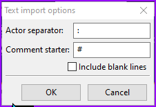
      4. The Text Import Options window prompts you for characters to separate different actors, and a character to denote comments in the subtitle file (comments do not appear onscreen). Enter characters if your transcript is formatted with them, otherwise ignore.
        Aegisub text import options
      5. Click “OK” and the file loads.
      6. The text grid populates with the contents of your subtitle/text file.
        Aegisub Text Grid
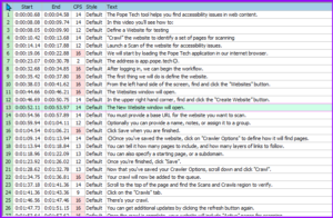
      7. Select the first row, and that subtitle will appear in the Subtitle Edit window.
      8. Edit the subtitle as appropriate for grammar and line length.
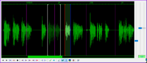
      9. Adjust the timing for the subtitle by moving the blue and red lines within the Audio editing window. Blue is the beginning, red is the ending. Other subtitles are represented with gray lines.
        Aegisub audio window
      10. Press ENTER when the subtitle is formatted and the timing is set. Aegisub will register the timing for your subtitle and move to the next subtitle line in the Text Grid.

Repeat this process until all of the subtitles have been formatted and properly timed to appear on screen.

That’s the essential workflow, continue reading to learn about optimizing your workflow, setting preferences, and how to format your subtitles so they are easier to read and understand.

Set Your Aegisub Options

Aegisub Preferences window.

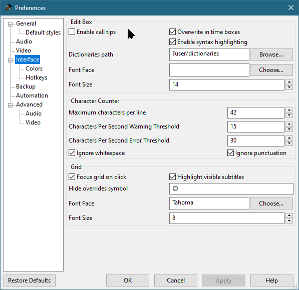
Goto “View\Options…” and select the “Interface” option to set the preferences for how many characters per line, characters per second warning threshold, and characters per second error threshold.

I set my preferences to 42 characters per line, 15 characters per second warning threshold, and 30 characters per second error threshold.

Click “Apply” when you are finished.

Colors

From the Options menu, click the “Colors” option under “Interface” and adjust the different colors used within the Aegisub interface.

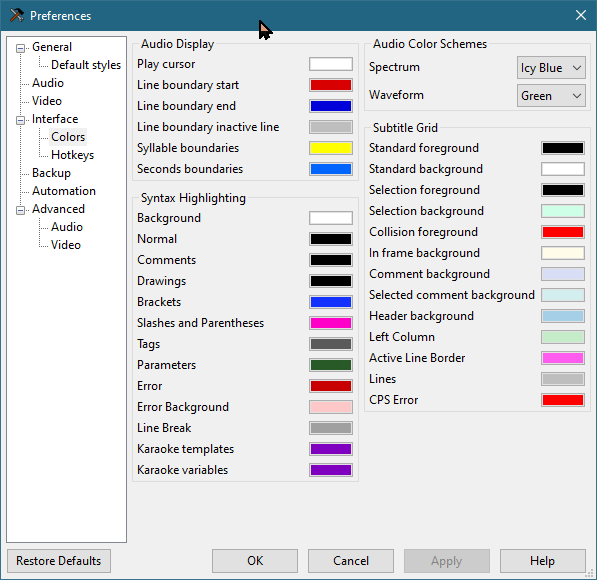
When finished adjusting your preferences, click “Apply” to activate your settings.

Click “OK” to close the Options panel.

Video Window

Go to the “Video” menu to open the video you are subtitling.

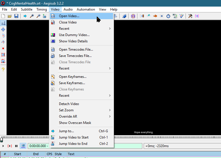
You can enlarge or reduce the size of the video window by hovering the mouse over the video and using the mouse scroll wheel.

There are multiple playback modes. Playback can be limited to the current subtitle line, or playback can proceed through the remainder of the video from the current subtitle line forward.

Audio Window

The Audio window displays the waveform for the audio. The area of the waveform between the red and the blue lines is the audio content corresponding to the current line of subtitles.

You can easily adjust the timing of each subtitle line by dragging the start or end lines within the audio window.

Editing Audio Timing

Within the Audio Window:

      1. Move the BLUE line to the beginning of your subtitle audio.
      2. Move the RED line to the end of your subtitle audio.
      3. Press SPACEBAR to play the audio for the current subtitle.
      4. Ensure the display time for the current subtitle corresponds with the selected audio.
      5. Press ENTER when you are satisfied with the timing.

Text Editing Window

Immediately beneath the Audio Window is the Text Editing window.

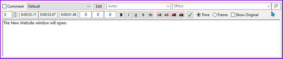
When you select a line of subtitles in the Text Grid, that subtitle will be displayed in the Text Editing window for editing.

Right click within the Text Editing window to access options for adjusting line length and splitting subtitles.

Use NUMPAD 5 to play the audio currently associated with the subtitle being edited.

Editing the Captions

Edit the subtitles according to the rules for editing captions, as described in the “Captioning Key” resource from the Described Media and Caption Program (DCMP).

Use the Captioning Key for full details of how to format different types of information, as well as how to style your captions for maximum readability.

Captioning Key: https://dcmp.org/learn/captioningkey

Formatting Language

There are many considerations for formatting subtitles to enhance their readability and understandability. Check out the Captioning Key for a complete explanation of how to format different types of information. In general, the following guidelines should always be followed:

      • Never split a prepositional phrase when breaking a line of subtitles.
      • Do not split a descriptor from the object it is describing when you break a line of subtitles.
      • Do not mix numerals with numbers spelled out in words. Choose either numerals or words and maintain consistency.
      • Do not separate a person’s title from their name when breaking a subtitle into two lines.
      • Include sound effects in brackets, such as: [car tires screeching],
        or [gun firing] BANG! BANG!…
      • Audio occurring offscreen should be italicized.

Maximum Line Length

It is important to format your subtitles so they do not form excessively long lines of text.

It can be difficult to read long lines of text and also pay attention to the video that is being shown. Best results are achieved when subtitles are around 42 characters per line. It is OK to exceed this by a few characters, but try not to go over 50 characters per subtitle line.

The Text Grid displays each line of subtitles with a column that displays the Characters Per Second (CPS). This column turns red when the characters per second meets or exceeds the levels you set in the Interface options, making it easy to see at a glance where you need to make adjustments to line length.

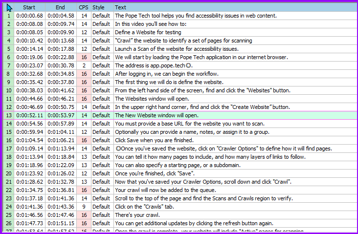
Using the Characters Per Second column, you can quickly identify any lines of subtitles that are too long for the amount of time they are being displayed. The Characters Per Second warning color and the characters per second error color can be set in the Options pane under “Interface\Colors”.

Displaying Two Lines of Subtitles

If you want to display two lines of subtitles on the screen, you can manually split the subtitle line into two lines by pressing SHIFT + ENTER.

Pressing SHIFT+ENTER will place a new line code(\N) in your subtitle file, indicating where the line breaks. The new line code will not be displayed on screen with the rest of the subtitle.

If you break a line of subtitles using the new line code (\N), the Characters Per Second displayed will reflect whichever subtitle line is the longest.

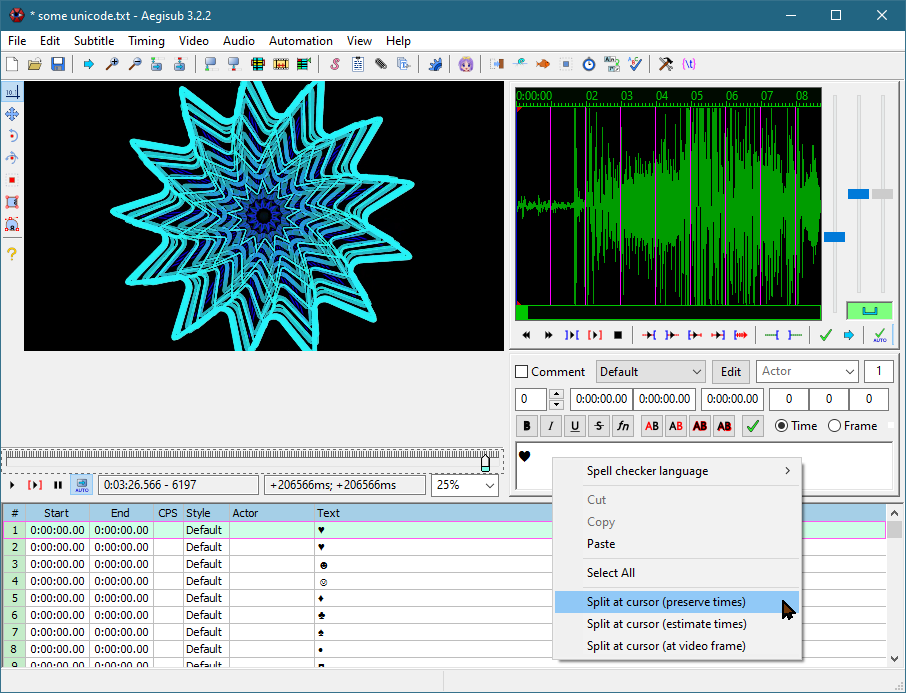
Splitting Long Lines of Subtitles

If you want to break a long line of subtitles into two separate lines of subtitles, use the Editing Window.

Place your cursor within the subtitle where you want the second line of subtitles to start, and click the right mouse button.

Choose “Split at cursor (estimate times)”, and the text spanning from your cursor to the end of the subtitle will be moved to a new subtitle line.

Conclusion

Follow the workflow at the beginning of this article until each line of subtitles has been formatted and optimized.

Save your .srt file, and use it with your video when you share it online or use the video in the classroom.

You can also download this job aid for the Aegisub Workflow for editing subtitles.

The Plain Truth of Accessibility

Magnifying glass lies on pages of opened bible.
Photo by Blake Cheek on Unsplash

Digital text is the foundation of accessible online communications. It is the primary structure of meaning that comprises the message being communicated.

Headings are then added to text, enhancing accessibility through increased usability.

Sure, but what does that MEAN?

To explore what this means, let’s take a trip back in time to when you were a seven year old child. Let’s pretend you’re writing a letter to Santa Claus in an effort to convince him you’ve been good this year.

The fact that you’ve been good and learning about accessibility is the essence of the message. This must get through, above all else.

However, the presentation of the letter matters too. Plain words can’t possibly convey the emotional significance of your message. You enhance your communication with sophisticated layout!

You might use colored markers or pencils – or both!

You could add glue and glitter, construction paper cut-outs, ribbons, stickers, gold stars and lipstick kisses. The creative arsenal of your seven year old self is truly impressive.

Whatever makes you happy – no judgment.

The point is that all manner of adornment could be added to your letter in an effort to make it more appealing, engaging, and ultimately successful at winning over Mr. Claus’ affection.

The one condition being, that at the root of it all is the meaning of your carefully worded message. The underlying meaning is something you want to be as simple, unmistakable, and straight forward as possible.

This way, when Santa runs all his mail through the new Anti-viral Sterilizer 9000 Spam Filter (with optional De-Glittering module), the main message remains intact.

Digital information can be styled to appear in many different ways, and the core of the message can be enhanced with semantic formatting and dynamic presentations, as long as at the root of it all the message is built on plain text.

The Honesty of Plain Text

Sign with the words "you are beautiful"
Photo by Gio Bartlett on Unsplash

If you open your information directly in a plain text application like Notepad on Windows, or TextEdit on MacOS, you see the entirety of the message in simple plain text. This is one of the most complete and unfiltered views of the text you can achieve.

One reason plain text is good for accessibility is because it has the least chance of getting screwed up in translation to other media.

If you take the plain text to a more substantial editing program, you set the stage for complex meaning. As you add styles and formatting to the text, your message begins to gather extra meaning. The words might still be the same, but they pack additional meaning.

Both behind the scenes and on the screen, your information is being loaded with potential to hold formatting information, semantic structure, alternate text descriptions, and interactive capabilities.

Accessibility vs Usability

There is a distinction between accessibility and usability when we consider digital information.

Sometimes a lack of usability is like dealing with a person who only tells you part of the story, withholding significant context and relational information that might affect how you perceive the message.

Some applications fail to support your content formatting, and they present a watered-down version of the data that appears fine visually, but is inaccessible to assistive technology.

Text without style and formatting might be something that you can load into your browser, but it is not always very much fun to try and make sense of.

Different Containers and Capabilities for Accessibility

Pure, yet limited, access is provided through Notepad – just the naked truth of your text. However, this is not a very usable option if you are using assistive technology.

Notepad does not allow for the formatting that makes your message usable. It is very accessible, but it is also very limited.

For usability, there is an important distinction between file format types, and the applications that create or present them. These applications are effectively different containers for your content. For example, there is Microsoft Word the program (CONTAINER), and there is a Microsoft Word File (CONTENT).

Microsoft Word the program has an accessibility capability as a container, allowing the user to effectively use the program with a variety of assistive technologies.

Microsoft Word the file format (.docx) has its own accessibility capability for defining your message – both within Microsoft Word the program, and other programs that are capable of opening a .docx file.

We understand that this .docx file will not have the same functionality if it is opened in a different program than Microsoft Word – but the message is capable of carrying the advanced meaning of its style and formatting. Many programs have the capability to read the content, even if they do not offer the same level of editing support as Microsoft Word.

Accessibility works the same way – not all combinations of file formats and programs provide the user with the tools to interact with the digital data – or in the same way.

The Most Accessible File Format

The question of what is the most accessible file format is answered through a measure of the capability to support access strategies for different types of digital information.

Perhaps not surprisingly, the answer starts simple and gets complicated very fast: HTML.

As a file format, there is very little that you can’t insert into an HTML file. In addition to an incredibly wide-open range of supported content, HTML also provides critical functionality for accessibility and usability.

HTML is also freely available, you can create HTML with the simplest of tools, and it is freely readable by many different browsers and other applications.

HTML is really hard to beat.

Two books next to a potted cactus, book titles: "HTML & CSS" and "Javascript & JQuery"
Photo by Greg Rakozy on Unsplash

And as you might know, it is also really easy to go down a deep rabbit hole with HTML.

I recognize that you are most likely an educator with a full load and you don’t have the time or desire to become an HTML expert. No worries, you don’t have to. You just need to use a modern CMS tool with the proper support – hopefully your institution has taken care of that.

Simple Best Practices for Accessible HTML

When you are creating HTML content, consider the tool you are using, and see if it can support the basic access strategies for digital media:

Access Strategies for Digital Media

Media TypeAccess Strategy
TextStructure (Headings, list styles, paragraph styles), Clarity, Legibility, Contrast
ImagesText descriptions and captions
AudioText Transcript
VideoCaptioning and Narrative Description
InteractiveText Labels, Keyboard Control, Section 508
ComplexAll of the above…
Above: Digital Media Access Strategies

The world is your oyster when it comes to HTML, and the more effort you apply, the bigger your pearl.

Sometimes a powerful tool can help make the impossible manageable, but too often we find that accessibility does not always make it into the awareness of the designers behind some of our favorite tools.

No sour grapes, HTML is wide open with potential.

When you find an inaccessible multi media construct, sometimes you can copy, paste, and redesign the content with the HTML tools of your CMS. This approach allows you to have a more accessible version of the content that lives in the CMS, and doesn’t require licensing fees or force students to buy a content pack.

Your only real limitations will come in the form of your CMS and its ability to support what you’re working with.

Thanks for reading!